Record Store


Process
Most of my posters use a photograph as the starting point. For this one I wanted to see if I could make something compelling without any images at all just shapes and text.
The circles in the background are based on the grooves of a vinyl record. They're doing two things at once they look decorative but they're also telling you what the poster is about before you've read a single word.
The challenge was making it feel warm and characterful without relying on a photo to do that work. The colour palette and the mix of a flowing script with bold block lettering gave it personality while keeping everything clean and intentional.
New Restaurant Opening


Process
A fictional new Vietnamese restaurant opening in Soho needed to stand out in one of London's most competitive food scenes.
Rather than laying text over the image in a traditional way, I wanted the typography to feel like it belonged inside the photograph something you discover as you look, rather than something placed on top. The curved text follows a path through the image, drawing your eye through the composition while carrying information about the food and the restaurant's story.
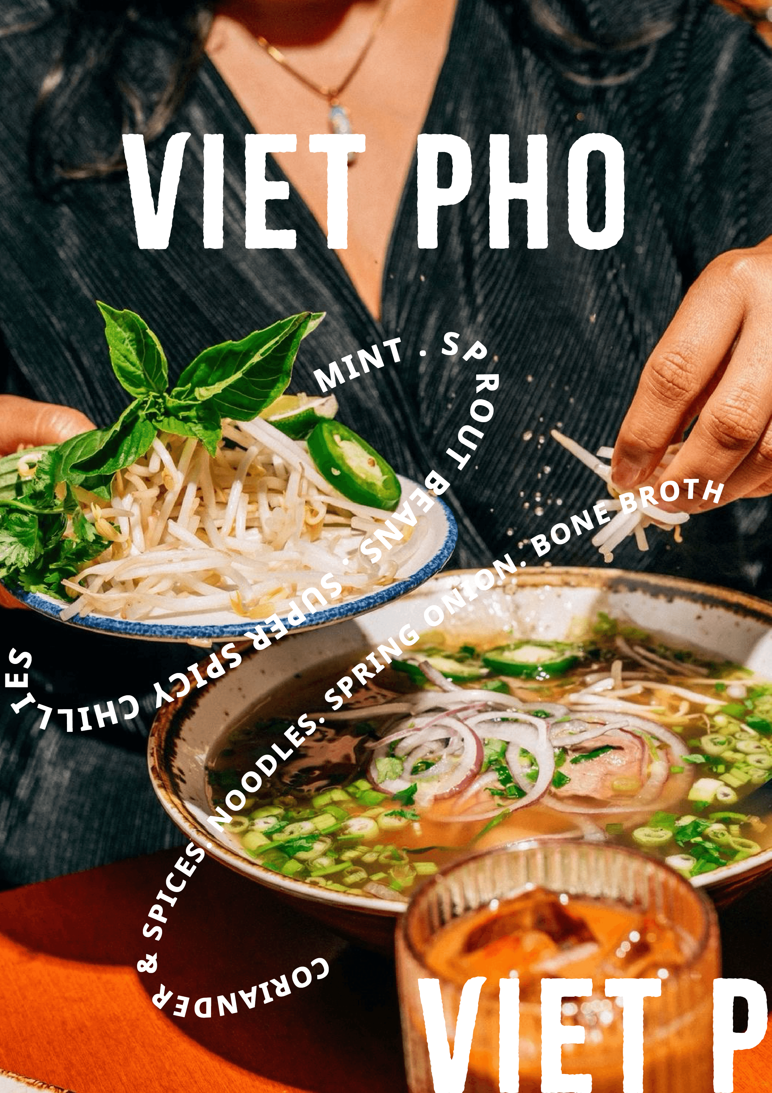


Exploring different variations
Restaurant Discount Offer

Process
Fish and chip shops tend to use the same visual language red and white, traditional fonts, nothing surprising. I wanted to see what would happen if you applied a completely different design sensibility to a familiar British staple.
The blue and acid green palette is unexpected for this type of food business, which is exactly the point. The font pairing mixes a flowing serif with a bold display typeface again, not what you'd typically see on a chippy promotion.
Satirical Poster

Process
A satirical take on clothing brands trying to market them,selves as sustainable while promoting fast fashion and over consumption


This started as a concept for a film poster. As I was building it, something felt off the image kept reading more like a fashion campaign than a movie. I think it was the sweater so i decided to lean into it. as i started creating an ad this satirical take popped into my head and i decided to just go with the flow

Original Image
Thrift Store

Process
The first few attempts weren't working. I wanted the ad to feel loud and alive something that would actually stop someone walking past it.


I started with a minimalist approach, but as I kept working it started looking more like a clothing label than a poster. I applied it to a mockup to see how it felt in context but it kept drifting further from what I actually wanted to make.

The first few attempts weren't working. I wanted the ad to feel loud and alive. Something that would actually stop someone walking past it.
Art Gallery Exhibition

Process
The idea for this project came from an image I saw of a tester referring to a dying rat as “the best employee they’ve ever had” a moment that exposed the disconnect between humanity and the reality behind these cruel practices. That line stayed with me and became the starting point for a satirical campaign designed to question how animal testing is normalised, despite the availability of ethical alternatives.
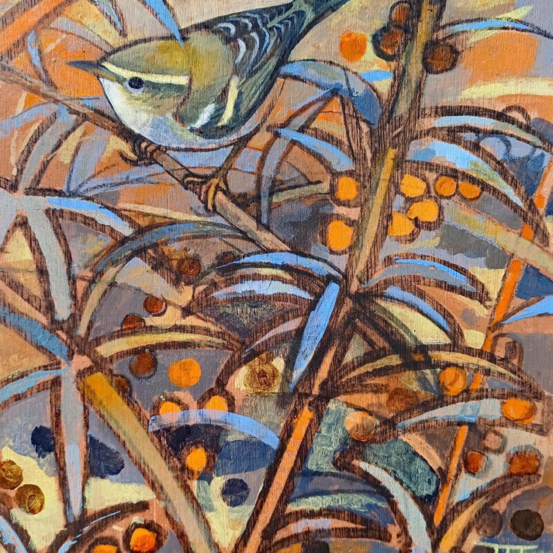
Original Painting Yellow browed Warbler by John Foker


I wanted to experiment with different grid style than what i usually used. Eventually I decided to experiment with an arial grid for this one but it became more challenging than I thought.

I tried to angle the painting to create the foundation to allign my fonts to. while keeping the information readable.

It started to feel unattainable until i came across this poster. The diagonal composition with the type running along the grid finally clicked into place.


I tried to angle the painting to create the foundation to allign my fonts to. while keeping the information readable and got rid of the empty spaces.
Art Gallery Exhibition

While working through the arial grid concept I hit a wall and decided to explore a completely different direction.
This version strips everything back. In most galleries, the small card next to a painting gives you a description of it along with the title, the artist, the date. I borrowed that format but repurposed it instead of describing the work, it's advertising the exhibition.
Cocktail Party

Process

Cleaner version without lace and the instructions


original image blended with the lace which is what Nottingham is known for although here it was only added to give a luxury feel to the poster
Event Poster

Process


Came across these two images on Pinterest and decided to create a fictional event poster around them.
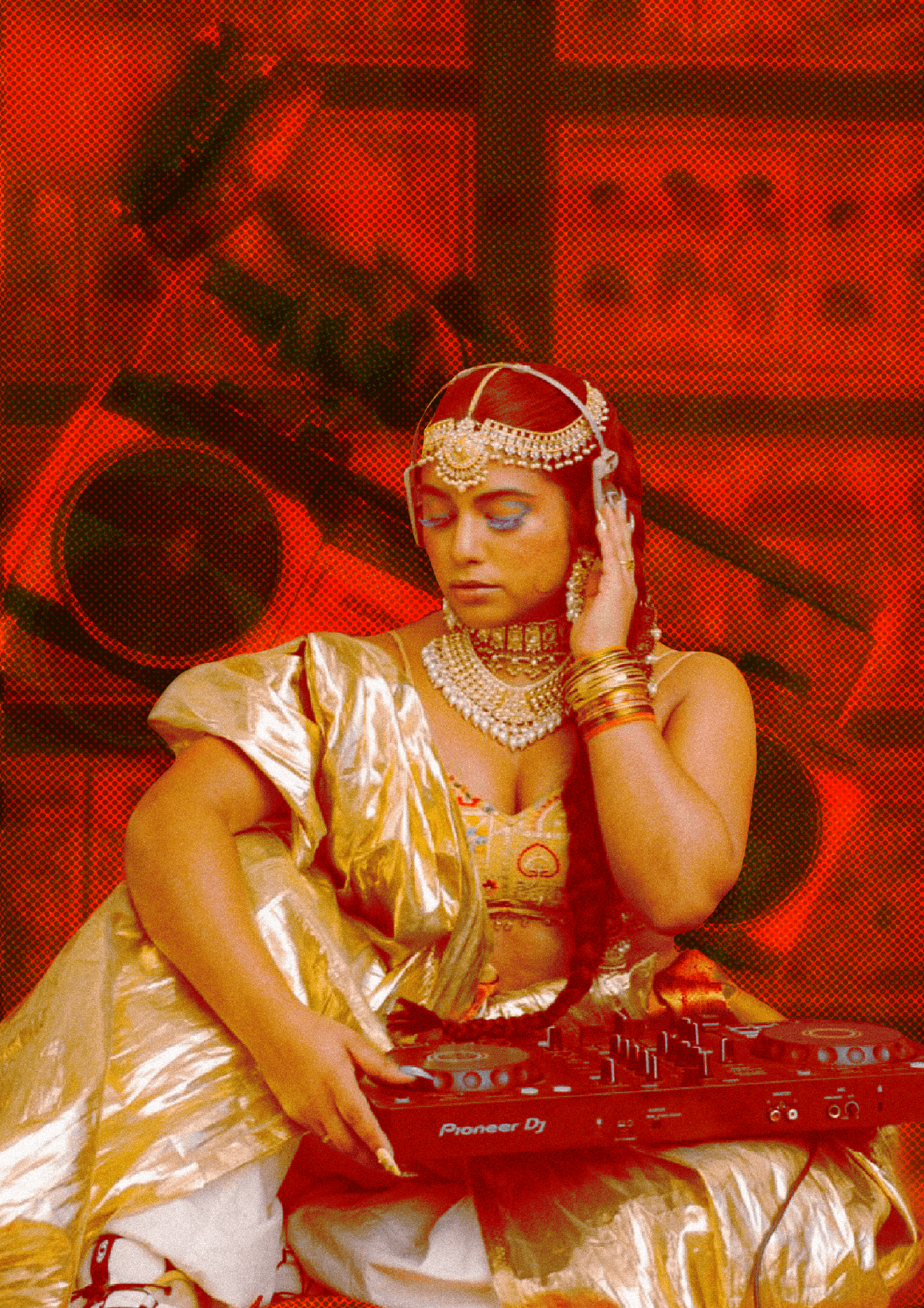

I experimented with different Photoshop settings adjusting noise, threshold, and saturation to push the image into a duotone feel. The goal was to make the two source images work together

I wanted to go the unconventional route with the typography but it looked too empty and didn't grab attention.

So I pushed the name to full bleed letting it dominate the poster entirely. The scale gave it the presence it was missing and made it feel like a headline act rather than a club night flyer.
Illustrated Calendar