VOLTURA

VOLTURA

Client Project: Packaging Design & Branding

Client Project: Packaging Design

& Brand Identity

Packaging Design

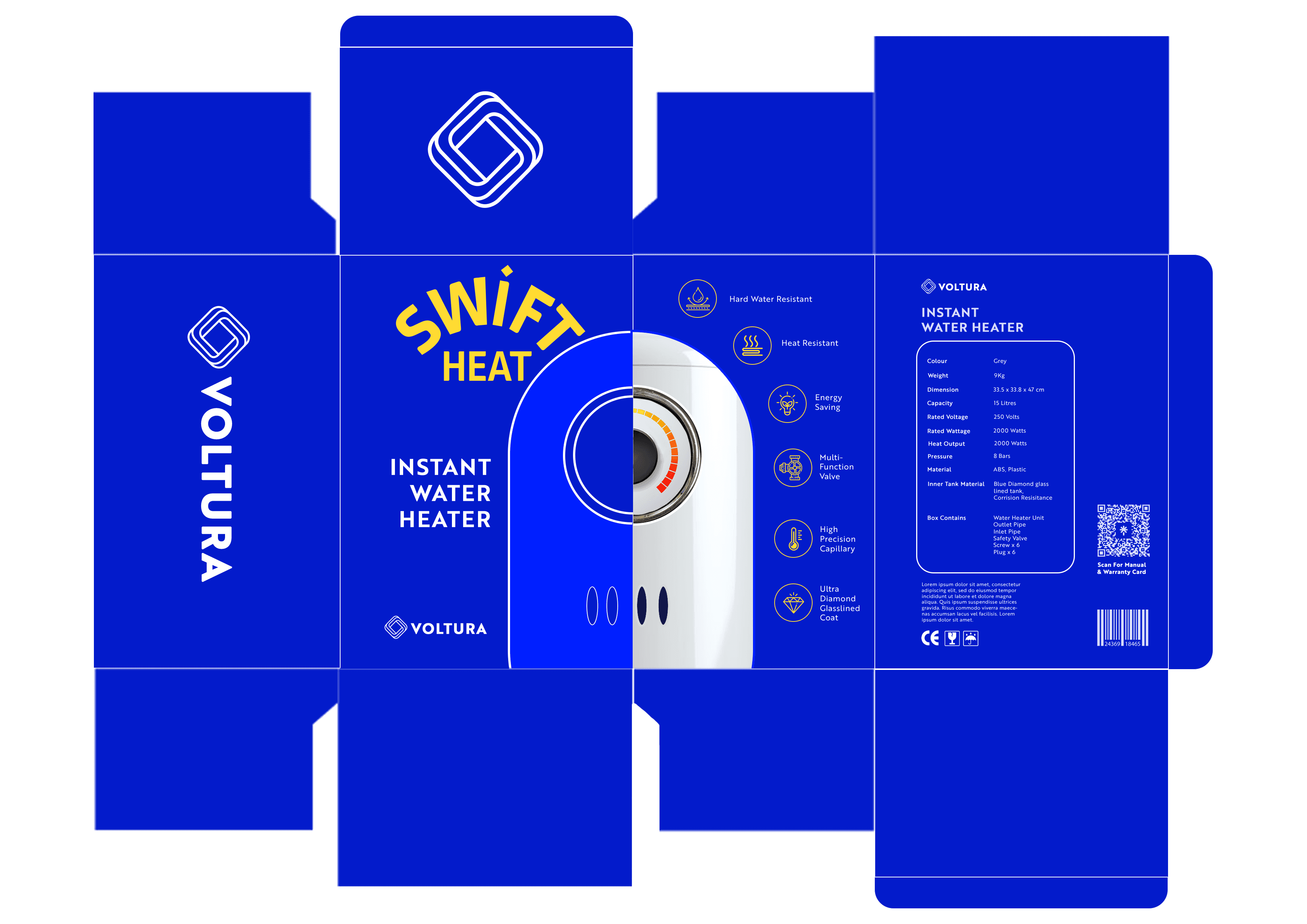
Voltura is a fictional brand inspired by a popular Indian electronics company specialising in high-quality wires and home appliances. The brief was to create a brand identity and packaging system that stands out from competitors while clearly expressing what the brand represents. The work also explores the use of 3D models and animation within graphic design.

The concept builds on ideas I developed during my summer internship as part of my capstone project. While the original client is under NDA and cannot be disclosed, I was allowed to present the designs using a pseudonym.

The project is presented in two parts, each going deeper into the process and reasoning behind the design decisions.

Process of creating the 3D models

Process of creating the 3D models

Blender

Blender

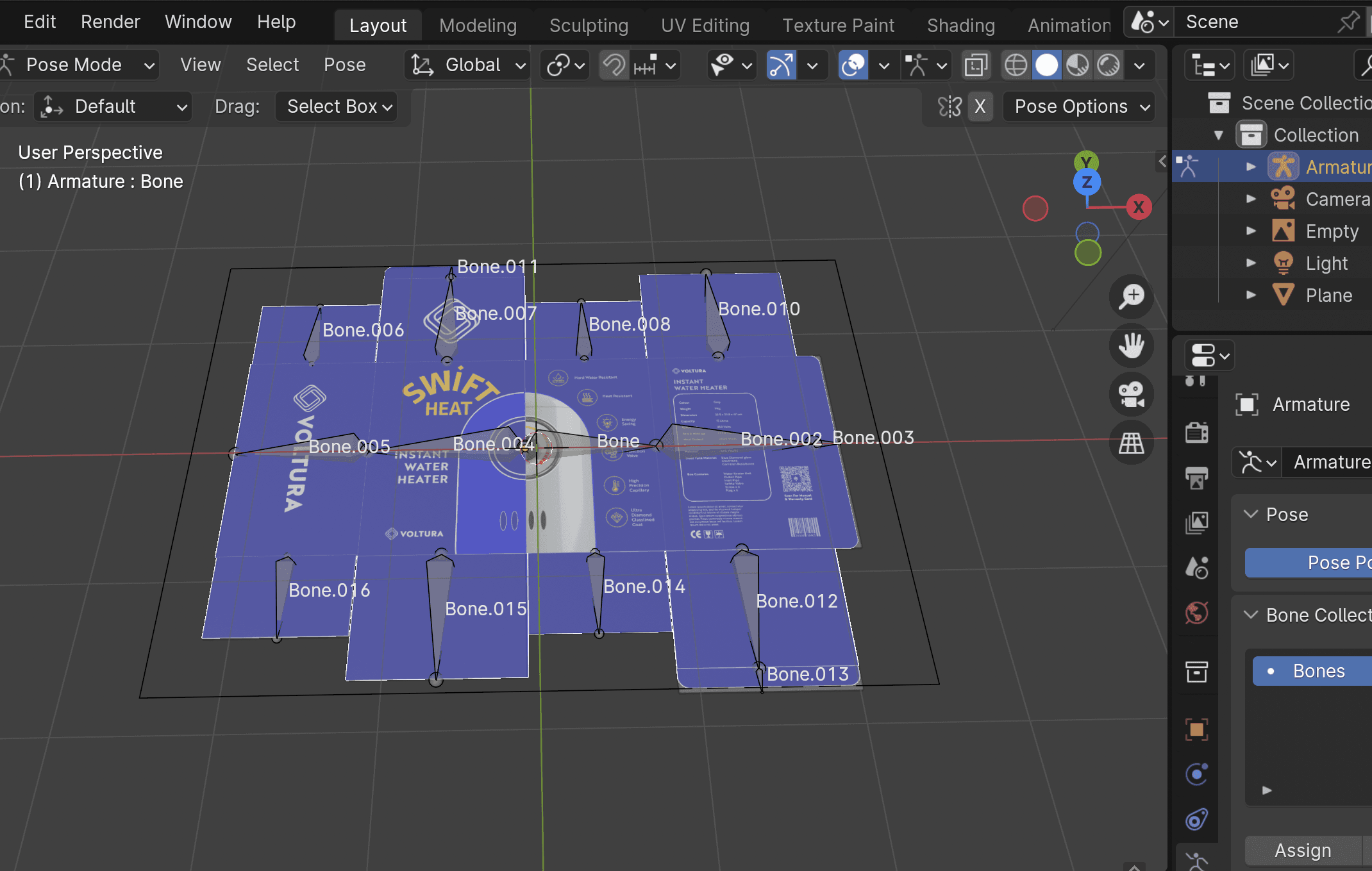
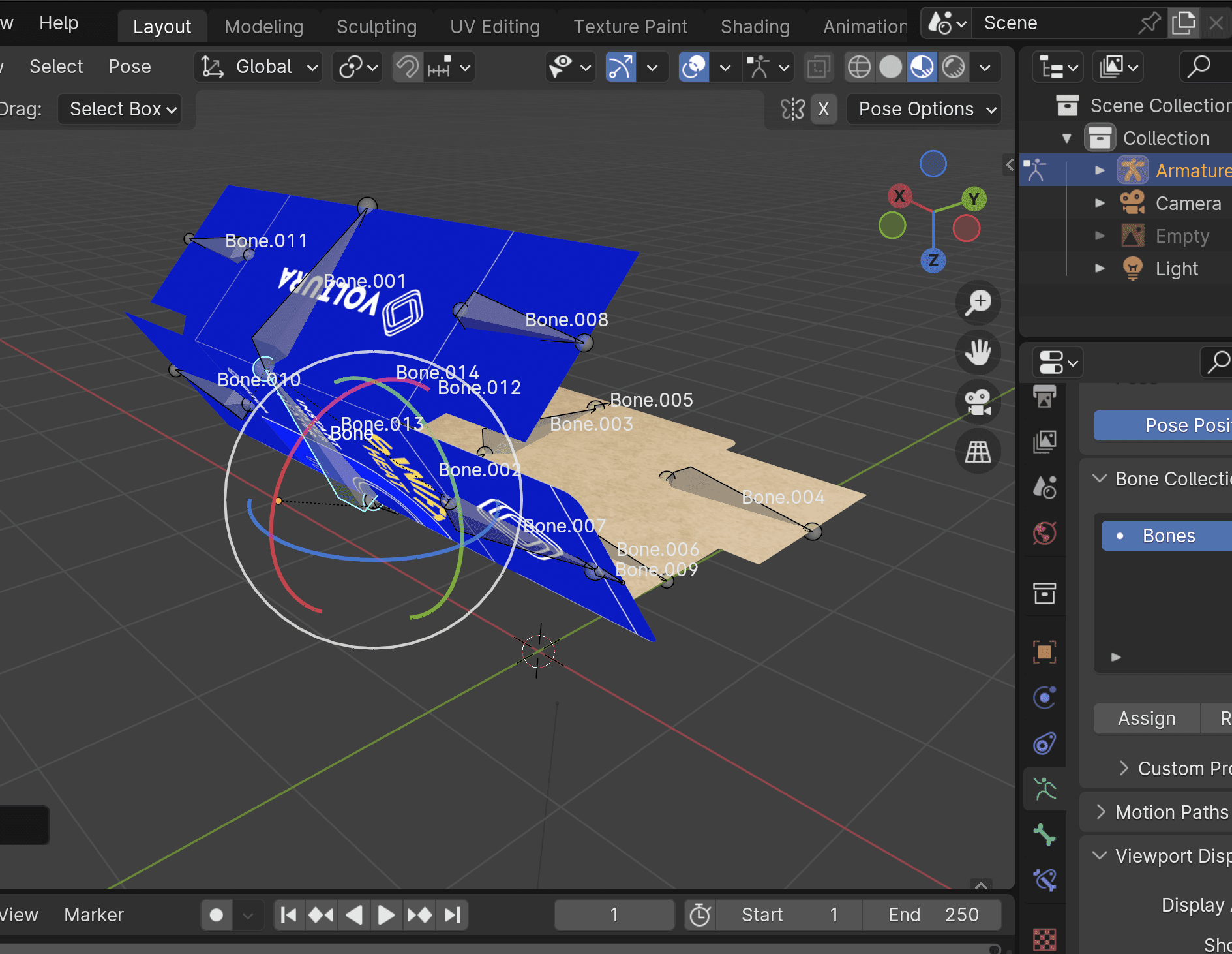
For the opening video, I started by recreating the die cut of the packaging in Blender. I then rigged it using spines, which allowed me to bend the packaging into various positions. This was my first time animating in blender, and it was a challenging process.

For the opening video, I started by recreating the die cut of the packaging in Blender. I then rigged it using spines, which allowed me to bend the packaging into various positions. This was my first time animating in blender, and it was a challenging process.

Adobe Dimensions
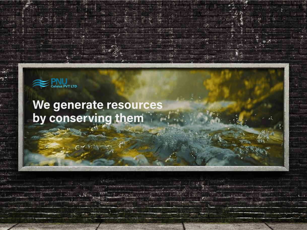
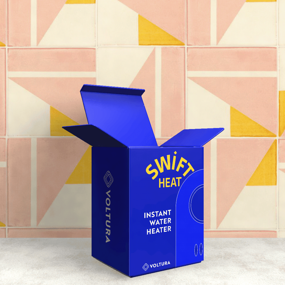
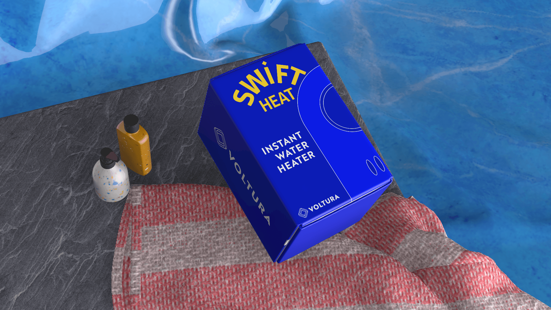
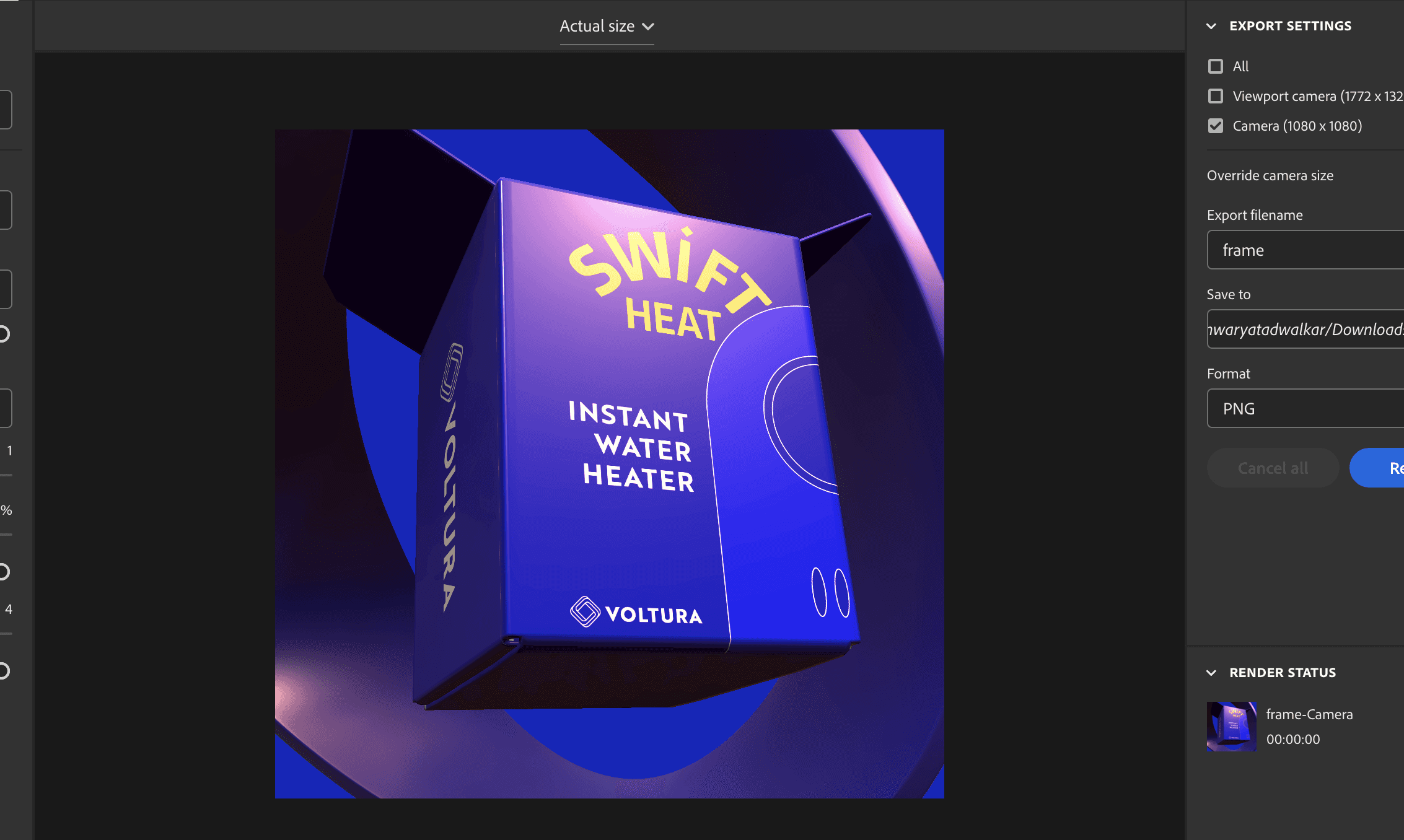
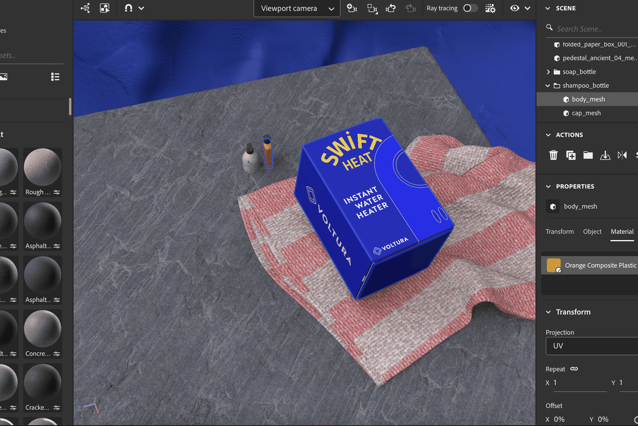
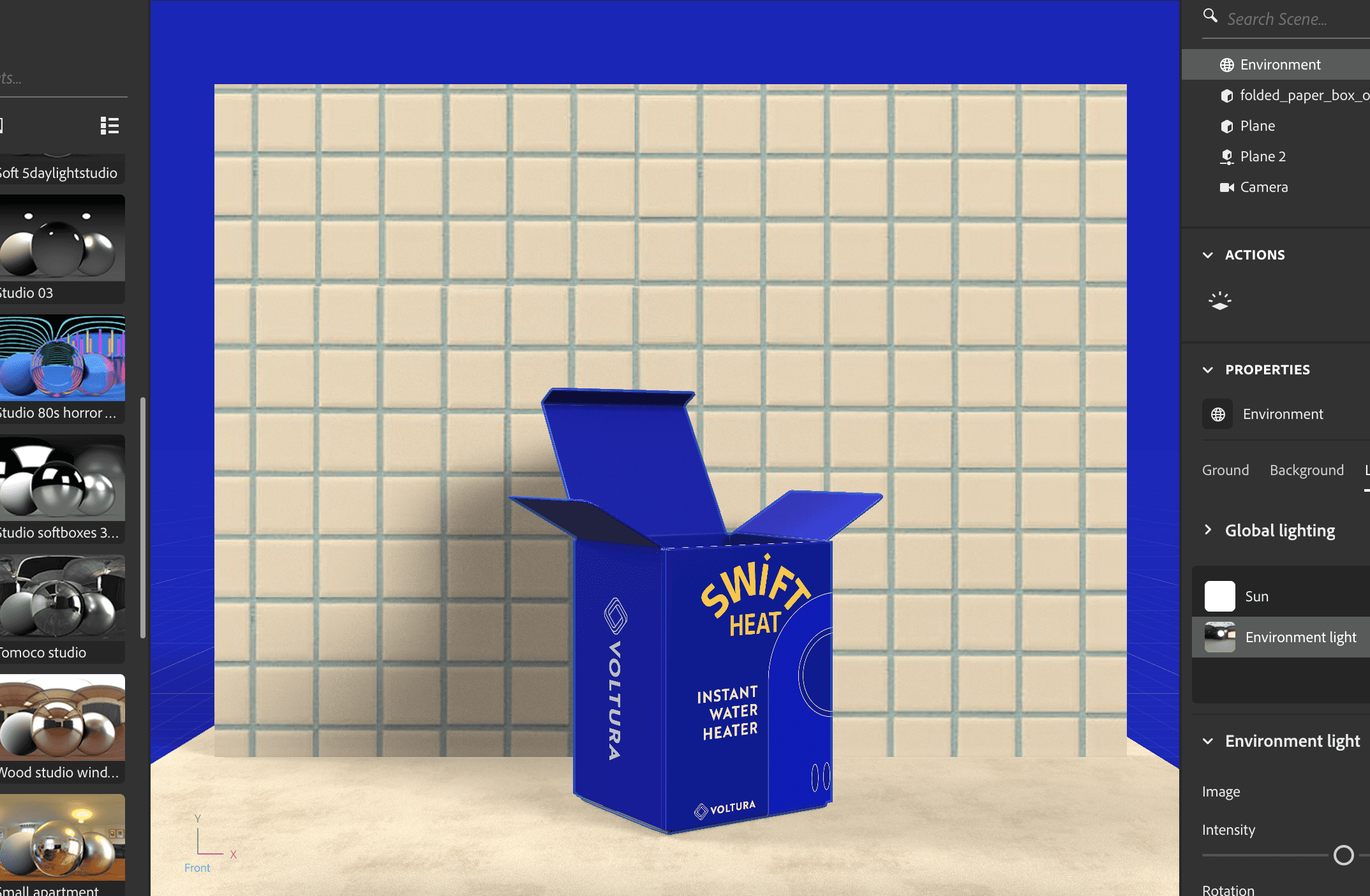
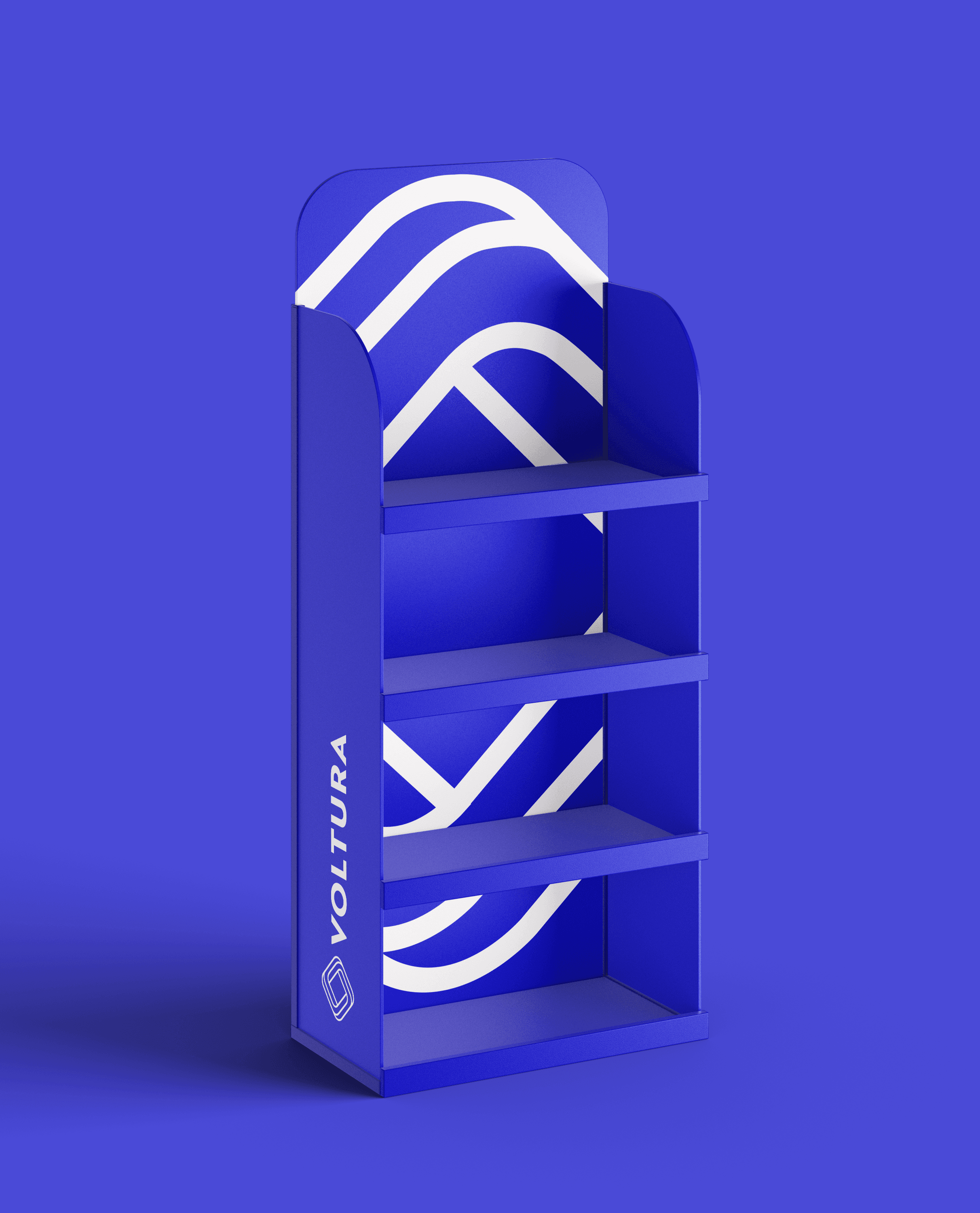
I used Adobe Dimension to create digital product visualisations. I explored different staging techniques, experimenting with various props and perspectives to find the most dynamic setup. I also played around with color combinations, which led me to discover the perfect blend of purple, violet, and blue. This stage of the project allowed me to get creative and really bring the design to life.

Creating and staging the packaging in Adobe Dimension was a fun experience. I started by selecting a packaging model from its library and applying my designs to it. From there, I explored different staging techniques, experimenting with various props and perspectives to find the most dynamic setup. I also played around with color combinations, which led me to discover the perfect blend of purple, violet, and blue, a combination I’m particularly proud of. This stage of the project allowed me to get creative and really bring the design to life.

Creating and staging the packaging in Adobe Dimension was a fun experience. I started by selecting a packaging model from its library and applying my designs to it. From there, I explored different staging techniques, experimenting with various props and perspectives to find the most dynamic setup. I also played around with color combinations, which led me to discover the perfect blend of purple, violet, and blue, a combination I’m particularly proud of. This stage of the project allowed me to get creative and really bring the design to life.

Brand Identity

Brand Identity

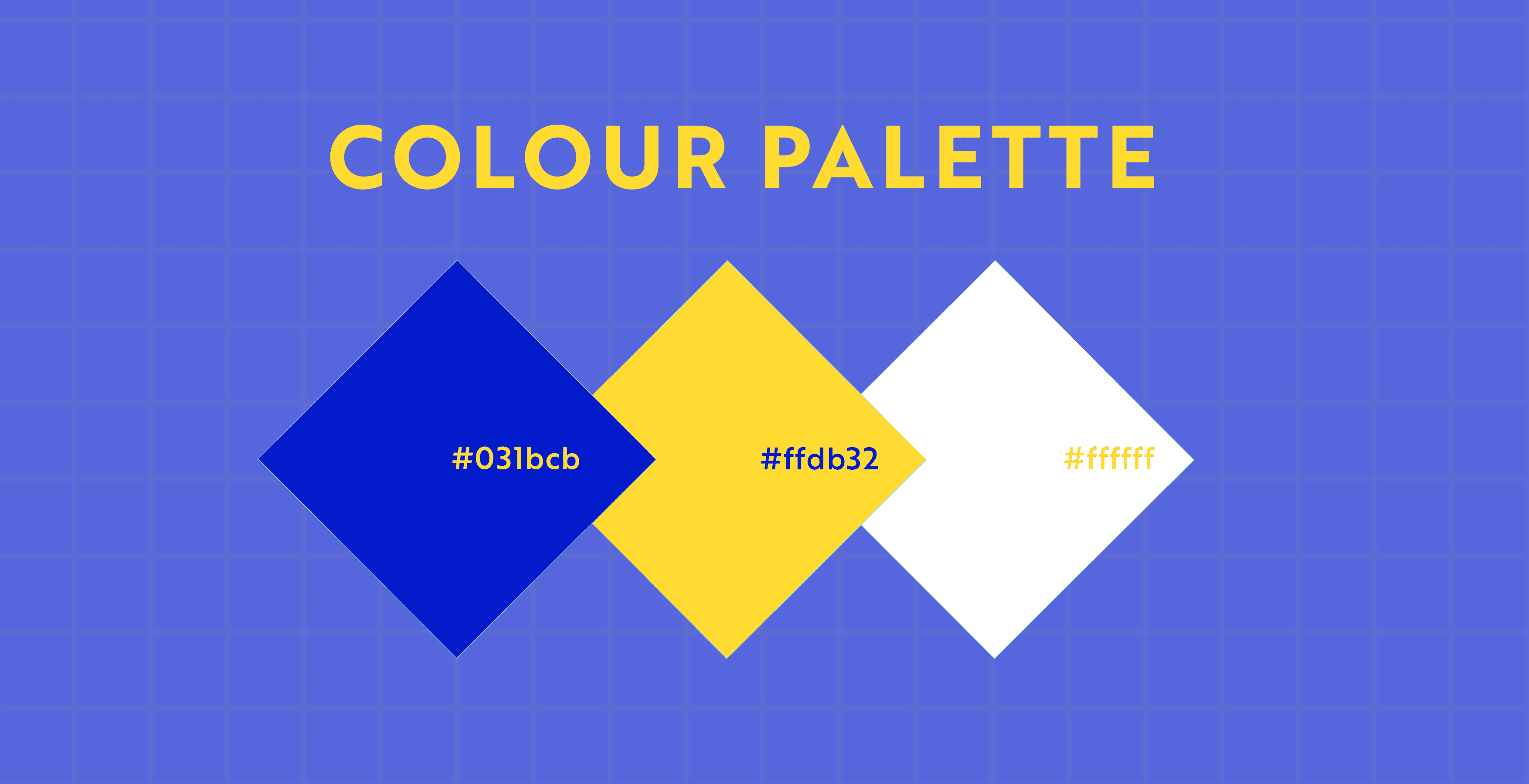
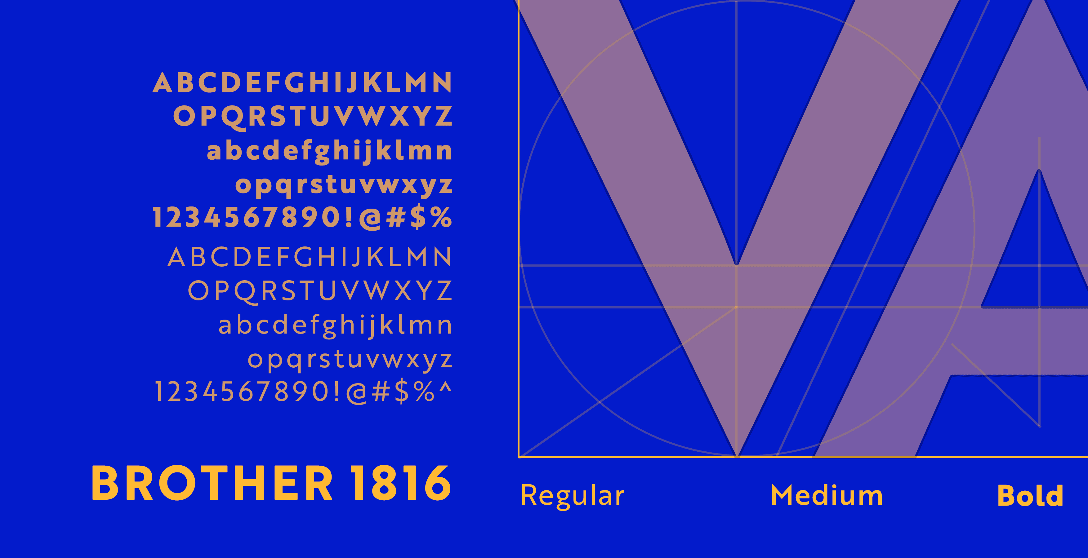
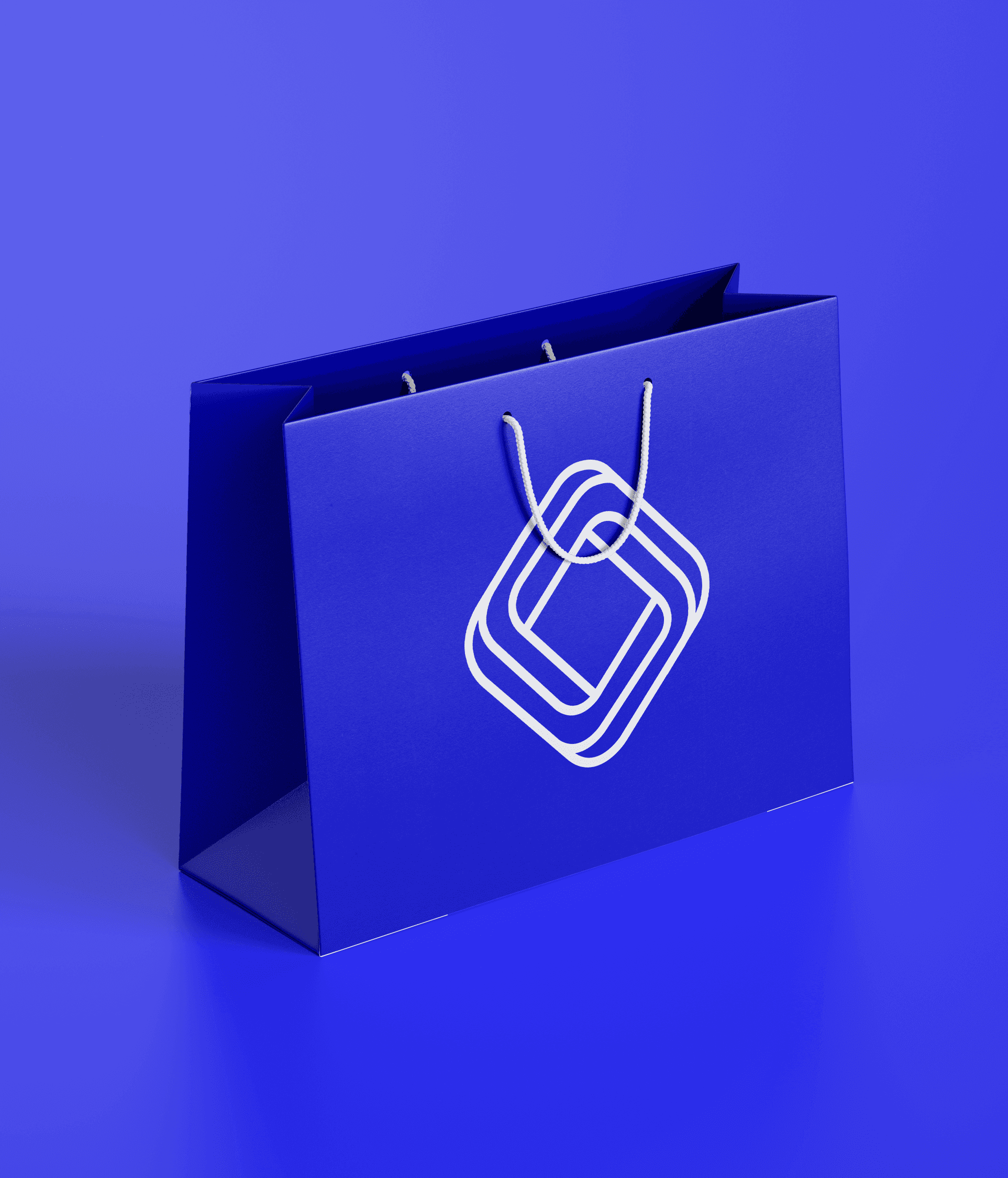
The logo is designed to symbolize the interconnectedness of wires, which is one of Voltura's main products and best-selling commodities. The design and the colour palette reflects the essence of the brand, highlighting the importance of connectivity, reliability, and innovation, key attributes of their vision statement. The market was saturated with red being the primary colour in most of their competitors' brands. Previously, they themselves had red branding, probably to fit in the market. But with blue now being their primary color, it not only makes them stand out from the rest of their competition. The addition of interchangeable white adds versatility across their packaging range.

The logo is designed to symbolize the interconnectedness of wires, which is one of Voltura's main products and best-selling commodities. The design and the colour palette reflects the essence of the brand, highlighting the importance of connectivity, reliability, and innovation, key attributes of their vision statement. The market was saturated with red being the primary colour in most of their competitors' brands. Previously, they themselves had red branding, probably to fit in the market. But with blue now being their primary color, it not only makes them stand out from the rest of their competition. The addition of interchangeable white adds versatility across their packaging range.

The logo is designed to symbolize the interconnectedness of wires, which is one of Voltura's main products and best-selling commodities. The design and the colour palette reflects the essence of the brand, highlighting the importance of connectivity, reliability, and innovation, key attributes of their vision statement. The market was saturated with red being the primary colour in most of their competitors' brands. Previously, they themselves had red branding, probably to fit in the market. But with blue now being their primary color, it not only makes them stand out from the rest of their competition. The addition of interchangeable white adds versatility across their packaging range.